Onboarding; A holistic view from New User to an EIP
How do we educate new and existing customers on the
NET-A-PORTER proposition throughout their user journey from an unknown user to an EIP (extremely important person)?
Initiative We would like to educate our customers on what our propositions are, new and existing features and our services. This will be for new, existing and EIP customers. Focusing on what we can do now and in the near future, the aim is to increase registration of accounts and in turn increase revenue.
Contents
Objectives
Analytics & Insights
Experience Audit
Competitor Analysis
Journey mapping
How might we?
Prioritisation
01. Objectives
Our Onboarding experience was few and far between and a better understanding of what currently existed along with what we could improve and introduce was greatly needed. To help educate and retain our customers to our business USPs and new features we wanted a holistic view so we could begin to create a consistent set of ways to communicate this.
Increase
Awareness of our products and service offering.
Acquisitions & Retention.
Business revenue by growing the user profile.
Reduce
Friction and drop off based on lack of understanding.
02. Analytics
The average basket value increases from a guest user to a registered user to an EIP user.
Guest user
£250
Average order value*
Registered user
£500
Average order value*
EIP user
£1000+
Average order value*
*Figures are illustrative.
03. Experience Audit
How do we onboard users?
App - Onboarding screens
Only once a user has decided to download our apps, do we briefly highlight some of our key USPs and services missing some of the most important.
Web - Site messaging
Messaging is discreet and not contextual or personalised.
Newsletters - Welcome email
Existing welcome emails are off-brand and vague.
04. Competitor Analysis
What are our competitors doing?
Some examples of what our ecom competitors are doing to onboard their customers to their products and services:
Farfetch - Hotspots: Giving further information about a feature
Mode - Pop-ups: Push notification
Thread - Gamified - Questions to later personalise the user’s experience.
Harrods - Infographic - Explaining their rewards program.
What can we learn from other types of on-boarding?
We decided to look at non-ecom experiences to see what we could take inspiration from. some examples were quizzes, overlay pop-ups with video tutorials. overlay tooltips and functionality explorations, walkthroughs with step by step introduction and a new feature or improvement announcements.
05. Journey Mapping
Workshop exercise
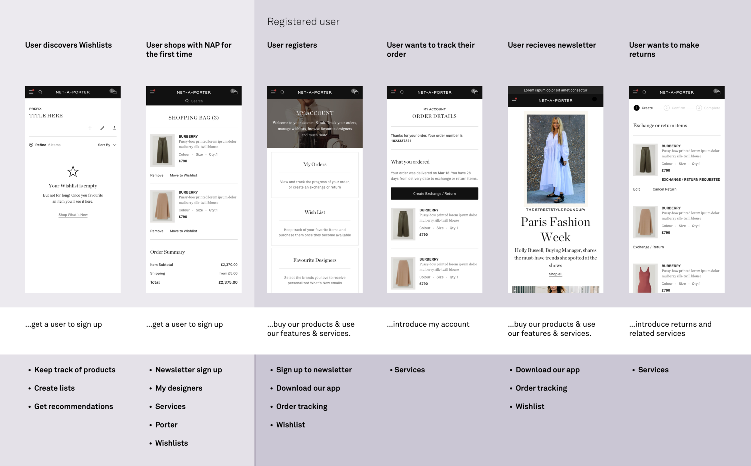
We then analysed all of the possible journeys our new user to returning EIPs make. We did this by running a journey mapping exercise to identify areas of improvement, missed opportunities and new in tandem with what was possible with existing technology. We also tried to identify future capabilities that aligned with our existing road map and the up and coming migration project.
Business focus areas (customer segments)
We grouped the ideas from the workshop into one of the three customer areas we wanted to focus on and mapped the onboarding opportunities to the points in the users’ journey.
Unknown/ Guest user
A new user who has visited our sites or checked out without registering.
Returning/ HVNEY
A user who has shopped and registered with us they may have installed the app.
New EIP
A high spending registered user who has spent past a certain threshold and is likely to make more repeat purchases.
Workshop outcomes
New EIP/Guest user registration
Newsletters
Teasing EIP services to HVNEYs
Wishlist (general / back in stock)
My Designers
Pre order / Reservations
Porter - Content
New localisation / Translation
New look and feel
New features
EIP services (repair & cleaning)
Delivery (Where we ship)
06. How Might We…?
A holistic view of opportunities against business focus areas.
Design workshop
We ran a workshop looking at the how might we…followed by crazy 8s to explore the way we could improve existing onboarding, identified missed opportunities and new opportunities.
We split the team into four groups based on their expertise in our four pillars of, Localisation, Services, Shop and Content.
Focusing on;
The three customer segments.
What is possible Now and Near.
Try to use components that exist.
Localisation
Services
Shop
Content
07. Prioritisation
We mapped all ideas from the workshop back to the customer experience journey and prioritised what we could do now and in the near future.
01. Localisation & Migration
Now
Focusing on the touch points when we migrate and localise. What that messaging is depending on where the user is and who the user is.
02. Guest User/ New EIP
Now / Near
Informing/celebrating our new registered and New EIPs what services and benefits are now available to them
03. New/ Existing Features
Now / Near
Introducing/ educating our users on features. Contextually to where they land on our site.
Recommended areas of focus
Localisation & Migration
Entry point
Country switcher
Services
Apps
Guest User/ New EIP (Post migration)
Guest Check out
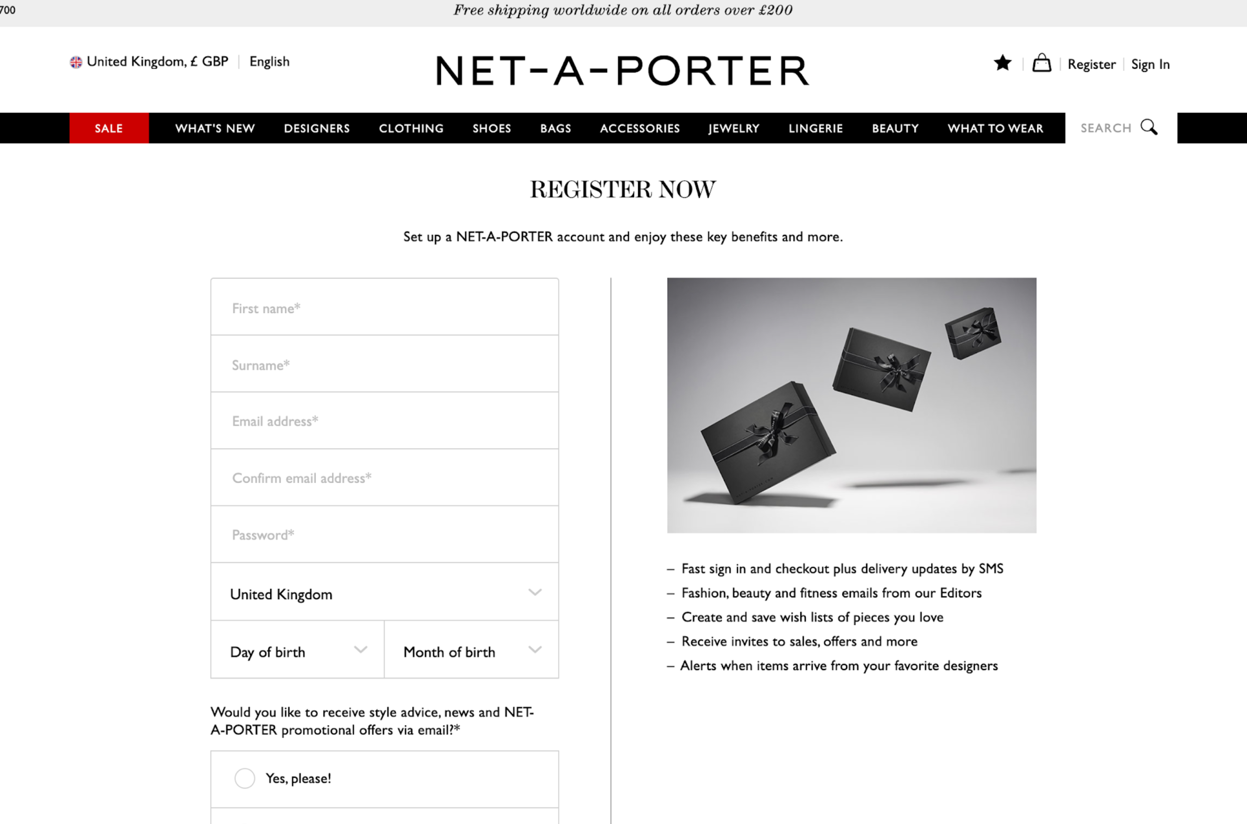
Benefits of registering
EIP program
What is the EIP program
How does a user get to be part of the program
Post registration
Set up details
Customisation (What’s new)
New / Existing features & services
My Designers
Favorite designers
Email newsletters
Whats New
Back in stock
New Designers
Messaging
Contextual messaging
Tool tips
Pt 2 - Design exploration overviews
Contents
Localisation - Change Country (country switcher)
Contextual Messaging (pre-reg)
01. Localisation - Change Country
Aim to find pain points in the existing experience to inform an improved approach when selecting the correct country.
Gorilla tested the current experience
Redesigned the experience inline with the Net-A-Porter migration project.
Tested with Users
Refined approach
Re-tested to validate
Refined final approach
02. Contextual messaging
Introduction/Brief:
Existing messaging example
Requirements for the business
Not just a pop up - To feel integrated and useful.
Develop a consistent approach and style that can be used for multiple types of messaging.
Needs to contextual and relevant to the user.
To use the CMS to output (not an image)
Driver:
Data suggested users were dismissing pop up messages before reading them.
They also were not contextual; for example the message to the right was shown to a returning user.
Types of messaging
Contextual and relevant to user type
Identify message variations
Example: New designer prompt on product listing page
Unknown User
Known User
Initial designs
Design one - Bookmark
Design two - The draw
Exploration for multiple messages
Refinement
Mobile breakpoint - Moved forward with The Draw design.
Simple CTA Message
Swipe for more information
Tap to expand more information
Desktop breakpoint - Moved forward with both the The Bookmark & The Draw design. On hover the would expand to reveal more.
Bookmark
The Draw
User testing
We tested the mobile designs with 10 participants from UK and US, 2 were EIPS and a mixture ages.
“I expect promos to be relevant to me especially if I am signed in”
The messaging component did not feel intrusive to the users
Confused by swiping action on DOB notification.
“I want to know more about the designer if i am going to sign up”
Findings
Users wanted more specific information per type of message
They over all preferred the expanding design
Context was very important to them
Refinement
Refined the expanding version
Included links to extra information
Made CTAs more informative.
Next steps
Test and validate desktop designs.
Build out a suit of messaging components to inject contextually into a users journey.


